 In the inaugural article of this series, I closed by saying art is not nonsense. It really is not. Now I must convince you, if you are not already in my camp, of precisely this.
As a former secondary school teacher, I can recall instances of very talented students saying to me, “Ms. I can’t do art anymore; my parents think it’s nonsense and it has no future”. Each time, although I could see a bright and astute budding artist, the parental intervention was bound to be made to steer the child towards medicine or engineering and my heart would sink. But I realised the dilemma of art in Guyana. Art is not understood. And, not surprisingly—as it appears it is given little to no emphasis in the formative years. I, for one, have no recall of doing any art in primary school while I have vivid memories of learning to write, reciting multiplication tables, and learning about foods. But I am, as the saying goes, up there in age.
 One term teaching art at the primary level at a private school about twenty years later revealed that my memory of art in my early years was likely correct. I met each class for 30 mins once a week and my job was to keep the students quiet and busy while their class teacher marked or did their records. I was horrified. I didn’t last. Timid to speak up, I looked for a way out. I found it. Art education for children should be fun. It should be characterised by play, discovery, communication, and validation. Depriving children of art or insisting they must sit quietly and colour neatly does nothing to encourage their creative thinking, their individualism, or the development of a sense of having a valid perspective.
As I stated last week, I will be introducing the fundamental building blocks of art in this series. These are the elements of art and the principles of design. I intend to discuss each of the six elements of art and the six principles of design and apply each to looking at and reading art. The six elements of art are Colour, Line, Shape/Form, Texture, Space, and Light. There is always potential to speak of these elements whether they are present or absent. Likewise, the principles of design can be spoken of whether they are evident or not. These are Balance, Emphasis, Scale and Proportion, Repetition and Rhythm, and Unity and Variety, and Contrast.
Colour is perhaps the most familiar of the elements, so let us begin here. From primary school, we learn that some colours are primary colours – red, yellow, and blue. We learn that light is made up of several colours and that by passing it through a special object called a prism we can see a range of colours that comprise the white light we see. These are a rainbow of colours. “ROY G BIV” is a simple acronym for remembering and ordering the colours produced when light passes through a prism—Red, Orange, Yellow, Green, Blue, Indigo, and Violet. Perhaps we are told more but my recall of primary school is dim. In art school, we should learn a whole lot more. In my case, I was given books on colour by my mentor. Yes, I read them.
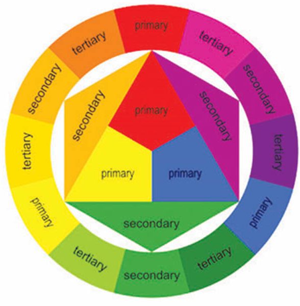
Keeping it simple the primary colours cannot be made by mixing any two colours together. However, by mixing two primary colours in equal quantities a secondary colour is achieved, and by mixing a secondary and a primary in equal quantities a tertiary colour is achieved. The colour wheel shows this relationship. Therefore, secondary colours are green, orange, and violet, and tertiary colours are blue-green, yellow-green, yellow-orange, red-orange, red-violet, and blue-violet.
The colour wheel is very useful to know as it also diagrams temperature of colours. Looking at our colour wheel, the left half comprises colours that are perceived as warm. The range of colours on this simple wheel from yellow-green up and around to red reminds us of fire, brightness, and grass seen under the light of a sunny day. On the other side of the wheel, from red-violet to green, are cooler colours. These colours tend to recede in space whereas the warmer colours advance in space. Therefore, in a painting, the artist may use colours strategically so as to allow aspects of the composition (the arrangement of parts) to appear closer to the viewer than others.
This play with colour temperature is relevant when attempting to communicate depth on a flat surface. Warm colours will occupy the foreground of the painting – that is the bottom of the painting that denotes the area closer to the viewer. Meanwhile, cool colours will tend to be used in the areas the artist intends to appear furthest away from the viewer. But, strategically using colour temperature also influences the mood of the painting. Using lots of warm colours will communicate the ideas of a painting differently than when lots of cool colours are used. And this is applicable to both naturalistic artwork – paintings intending to imitate the natural world, as well as semi-abstract and abstract artwork which do not intend to imitate the natural world, although they may be influenced by it.
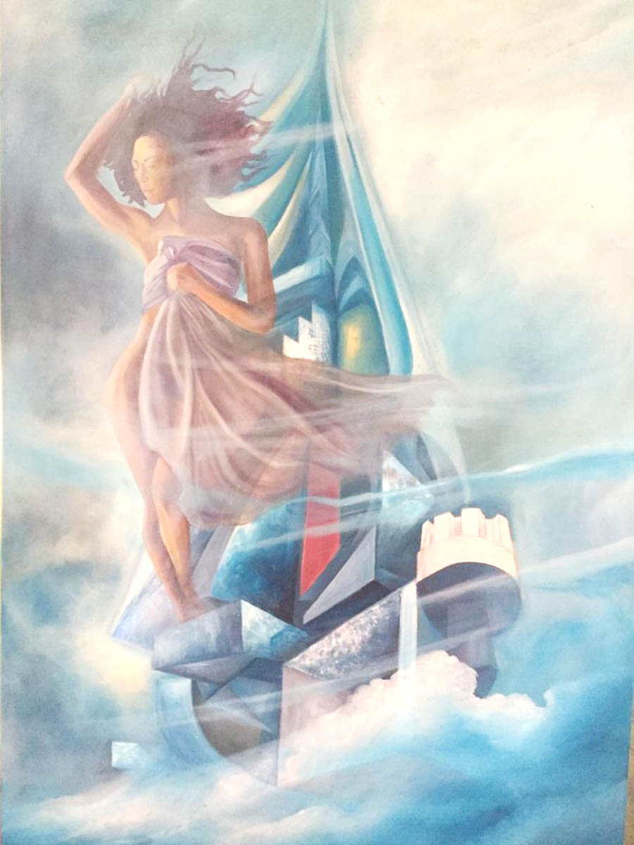
Thus, looking at Her Escape by Oliver Smith one recognizes immediately that cool colours are used along with the surprising appearances of warm colours -red and yellow. Smith’s composition is largely derived from the hue (the general name for a colour) blue. At times Smith adjusted the blue by adding white, black, or gray. Thus, while blue is a dominant colour it is not repetitive and boring. Blue, we know is a primary colour. Therefore, the surprising occurrences of red and yellow complete the triad of primary colours. And as yellow yields to blue, green emerges.
Notice on the colour wheel that there is no white or black. In art, these two are not considered colours but they are useful to achieve tints and shades of a colour. Tints are achieved by adding white to the colour, while shades are achieved by adding black to the colour. By adding grey or white and black the artist desaturates the colour or reduces the intensity (brightness) of the colour. While both white and black are available to be purchased, caution should be used when using manufactured black as it is generally considered a ‘dead’ black. It should be used sparingly. It is heavy and without character. Instead, by combining the primary colours in varying quantities, the artist is able to achieve coloured blacks which are by far more exciting to use as they produce better shades and desaturated colours.
The colour wheel is also very useful to know as it diagrams the colour schemes. Colour schemes are arrangements of colours that help to create harmonious and aesthetically pleasing colour compositions. These are monochromatic, analogous, complimentary, and polychromatic colour schemes. In the case of a monochromatic colour scheme, the artist uses one hue and adjusts it using black and white. With an analogous colour scheme, the artist uses colours that are adjacent to each other on the colour wheel. The composition may be singularly warm or cool or lean to one or the other depending on the range of adjacent colours selected. Meanwhile, the complimentary colour scheme is composed of colours directly opposite each other on the colour wheel. Colour compliments are said to brighten the appearance of each other when placed side by side. Lastly, the polychromatic colour scheme makes use of any combination of colours on the colour wheel.
Despite the dominance of blue in Her Escape, it is more accurate to say the composition employs the polychromatic colour scheme. Smith’s female figure is coloured naturalistically – to look like what is perceived in nature. Thus, he has used local colour – the object’s natural color – brown. Brown is a derivation of red. The figure’s garment which blows freely in the wind is also a derivation of red, this time a desaturated violet. Consequently, Smith’s standing figure in its derivations of red echoes the small vertically oriented rectangle which is painted in primary red – cadmium red. Meanwhile, the most obvious area of yellow, in line with her hips, is echoed on the sails and this subtle repetition of colour leads the eye to her face and her wind-swept tranquility. Therefore, colour can be directional.
What more can be said about Smith’s use of colour in Her Escape?
Akima McPherson is a multi-media artist, art historian, and educator.