 In our final discussion regarding the Principles of Design, let us turn to unity and variety first and to contrast second.
When we talk about unity in art, we are talking about the same concept that is applied to how ideally, we wish people of different orientations should live – in oneness, in harmony. Therefore, unity in art refers to the composition’s different parts co-existing within the whole harmoniously. Unity allows us to feel like the work is a singular unit that is meant to be rather than an awkward assembly of parts. In other words, unity allows for the parts to come together to create a sense of oneness and belongingness.
You may recall, two weeks ago we discussed repetition. Repetition is one way of creating unity within a composition. Repeating a singular different element makes it seem to belong. However, we do not want to repeat parts too often and create monotony. Why not? Well, monotony breeds boredom. Suppose you ate split-pea cook-up rice every day for lunch. Chances are after a while you will get bored. To avoid monotony the artist introduces variety. Likewise, you may vary the cook-up from split pea to blackeye pea to vegetarian. Variety perks things up. In the art-object variety adds areas of interest. This is achieved by introducing a different element of art or a variation on an element already in use. But there is no formula for achieving unity and variety.
Contrast is the final of the six (6) principles of design. Contrast in art is good. Contrast helps to eliminate monotony. In some instances, it helps us to see the form better and in others, it can move our eye around the composition. Contrast can also be communicative. Therefore, contrast in art is characterised by the use of dissimilar visual elements to create interest and meaning in a work. Sounds like variety? Well, contrast also contributes to variety. Think of a pencil/graphite drawing of fruit in a bowl. If the artist shades the fruits using very similar gray tones it will be hard to identify which fruit is in front of the others by looking at the tone alone. Overlapping edges will have to be the giveaway. But if the artist varies the tones – perhaps the objects in the back are darker than those in the front s/he will be able to better communicate the placement of the fruit in relation to each other. By darkening some tones and lightening others the artist introduces variety in tones as well as contrast. Therefore, a variety of tones allowing for contrast helps to make the drawing a more communicative one.
Perhaps knowledge of the gray scale may be useful to the conversation at this point. Take two pencils each with a number and a letter printed on the lower end. For instance, 2B and 4B pencils. The higher the number, the softer and darker the graphite. Rub the side of each pencil’s tip on the paper to create a box of a consistent gray. With this first box try to apply minimal pressure to the pencil. Below this box, as you apply a bit more pressure, repeat the exercise of the first box. Create more boxes of gray each time applying slightly more pressure than with the previous box. In the end, you should have a tower of boxes of gradually darker grays from top to bottom. This is the grayscale. Looking at the equivalent boxes you will notice that they do not produce the same tones at the same level. The 4B will always be darker. Thus, in a 2B pencil drawing of fruit by pushing the extremes of the pencil one is able to create variations in tones but by using multiple pencils – i.e. using a 2B and a 4B – the tones produced should be sufficiently different so as to create low or high contrasts within the composition.
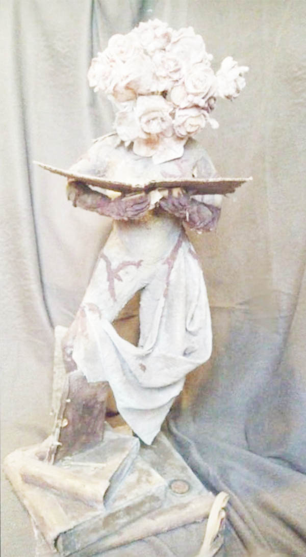
Bloomage by Anesia Joseph-Gonsalves is clearly not a black-and-white graphite drawing. It is a mixed-media sculpture – meaning more than one kind of material was used to make it. Perhaps it is immediately evident that Bloomage is a surreal rendering of the youthful human form. Nonetheless, Bloomage is also a beautiful example of the principles of design at play. In addition to being life-size to the body of a child, the internal human-like aspects are naturalistically proportioned. Thus, the scale and proportion of the figure are imitative of the human form.
But what of unity and variety, and contrast? Standing on a stack of books the girlish figure in Bloomage contrasts with the geometry of the books. Accentuating the organic character of her body, drapery hangs across her body from her left hip to her right thigh. The deep open folds of the drapery echo the deep closed folds of the flowers which form a bouquet and replace her head. The edges of the books form straight lines, which repeat but vary in their directional quality. These lines move the eye upwards within the composition to the curved edges of the deep folds of the drapery. These, in turn, continue to carry the eye further upward within the composition, give away to an implied line, and this line carries our eye to the bouquet-head. The lines that carry the eye upward and into the composition are contrasted by sudden horizontal lines created by the arms and the open book. These lines contrast directionally and in terms of movement. They stop the survey. Instead, the lines of the open book start an incomplete frame that frames the bouquet-head, with its downward, presumably contemplative glance.
In Bloomage there is unity in the repetition of straight lines that move the eye. The potential monotony of straight lines is broken by the curved lines of the drapery. The drapery is singular but is harmonised with the other elements by being organic in form like the body it does not hide. The boquet-head is similarly organic and while it demands attention, it is not undue. The head we realise tells us somethings about the girl – her sweetness and innocence. Perhaps she is a prolific reader, we may infer these books are helping her to bloom.
Now, consider how the consistency of the material used harmonises the composition. Likewise, the material’s colour and texture is maintained and therefore does not distract or demand undue contemplation. In Bloomage, disparate parts create variety but they are unified by lines, colour, and texture, while geometric and organic forms contrast meaningfully.
In the next discussion, we will close off on the elements of art by looking at light.
Akima McPherson is a multi-media artist, art historian, and educator.