In visual art, scale refers to the size of the object represented in relation to the human body or the real-life counterpart of the object being represented. Thus, in art it is possible to speak of a work being life-size, and by this, it is understood that the object is re-presented on a 1-to-1 scale. In other words, a unit of measurement of the art object equals the unit of measurement of the actual object in real life. Proportion refers to the parts and how they relate to the whole. Therefore, scale and proportion are relative measures.
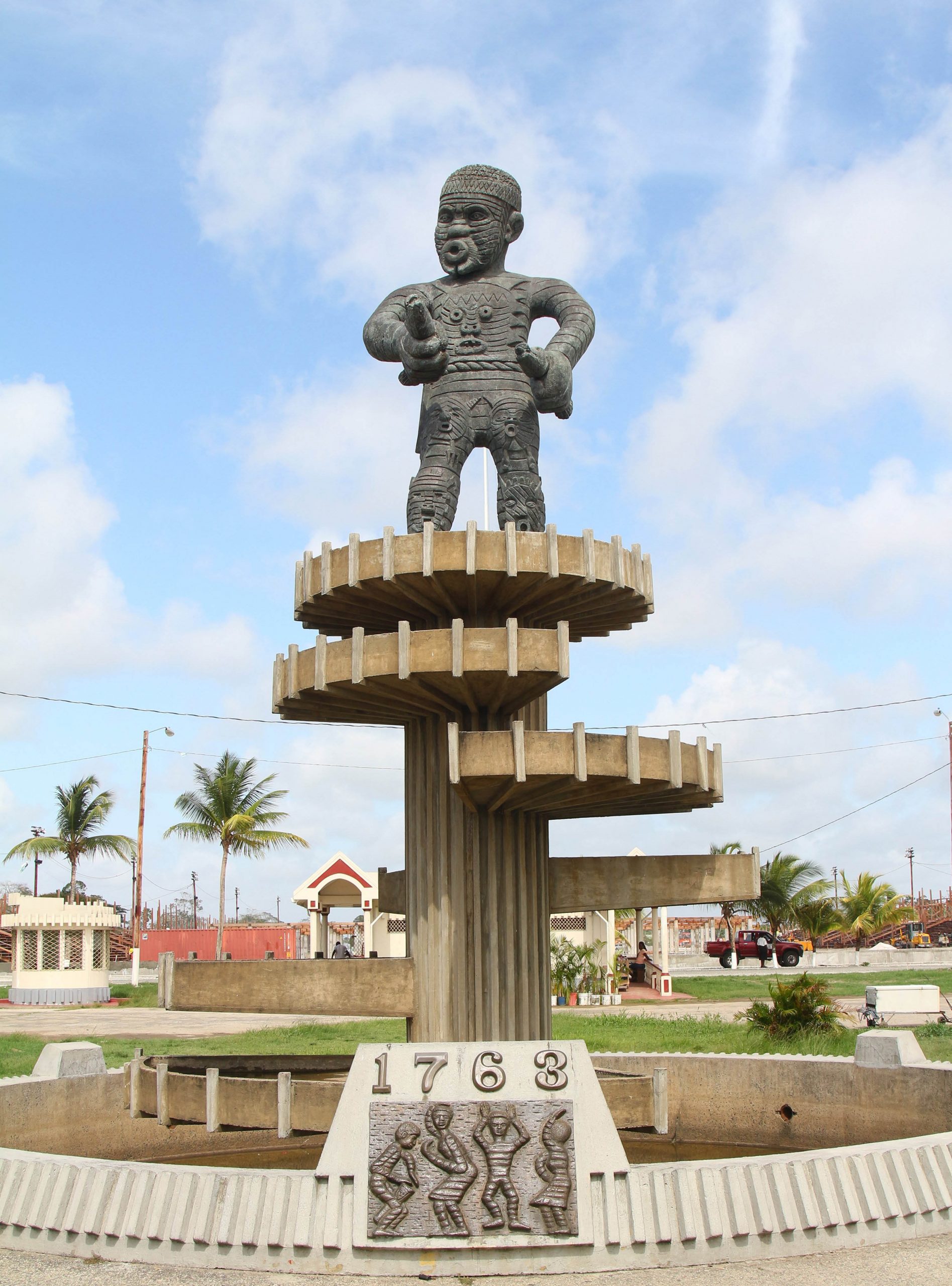
The scale of the work may be adjusted away from 1-to-1 in relation to the actual object. Not doing so may result in a work of art that is too small, causing it to lose some of its communicative power or ability to function as the artist intends it. A brilliant case in point is the Kofi/Cuffy figure in the 1763 Monument. Imagine if atop the elaborate spiraling structure Kofi were life-size, or only slightly larger than life-size. The presence of Kofi, commanding attention and dominating the space would be lost. By adjusting the scale of the figure, the artist, our venerable Philip Moore (d. 2012), is able to communicate the importance and character of the real-life person we commemorate.
In addition to carefully manipulating the scale of the work, Moore also manipulated the internal proportions of the work. Most evident is the size of the figure’s head. In naturalistic figurative drawing, the length of the human head is taken as one measurement and is used as a standard for positioning the other parts of the body in whatever posture the body assumes. It is a bit complicated to explain but the point is that today it is generally accepted that this unit of measurement can be found within a typical standing body 7.5 times (inclusive of the head). Therefore, looking at Kofi atop his elaborate plinth we realise his body proportions do not conform to this standard. The head of the figure appears much larger. It is about one-third of the body.
Perspective refers to the art of depicting three-dimensional objects on a two-dimensional surface so they appear realistic, having the right impression of their dimensions – height, width, depth, and as though they occupy real space. The rules take into account the usual placement of the art object in relation to the viewers. Hence, in works that are to be positioned above the head of the viewer certain adjustments need to be made to give the appearance of the right proportions. In Moore’s Kofi, it was inevitable that the head of the figure would be slightly larger to appear smaller when viewed from the ground. The same can be seen in the famous David by Michelangelo.
But of course, Moore’s Kofi has an unusually large head. Kofi’s head appears much larger than it should be in relation to the body. It does not appear naturalistically proportioned. Instead, the proportions are manipulated so as to be symbolic and communicative. The figure of Kofi conforms to some traditional art of West Africa in which the head is disproportionately larger to relate the head as a locust of human existence. This I find beautiful – a monument to this man of West African origins that evokes the art of his region.
Another beautiful aspect of the 1763 Monument is its employ of rhythm and repetition. In visual art, the repeated use of an element of art creates movement of the eye and sometimes the movement is rhythmic. Repetition has the effect of unifying the composition also. Think about it, in a painting of circles and squares that is of different blues, the inclusion of a red square will stand out and draw attention to itself. However, if the artist repeats the use of red on other squares the single red square will not stand out as odd. We will not question why this one square is red in relation to the others. Instead, the repetition allows you to see the red square as premeditated. Perhaps, too, the red square repeats, moving the eye through the composition rhythmically. Much the same is happening in the 1763 Monument.
We sometimes forget that the 1763 Monument is not the figure atop the plinth (the base supporting the statue) alone, but the columnar plinth, the symbolically proportioned figure, and the pool at the base of the plinth. We can see that Kofi stands on top of a cylindrical pillar – a columnar plinth – that is topped by a large circle with a diameter that is bigger than that of the cylinder. At the base of the plinth is an even wider circular enclosure that repeats the circle already noted. Along the column’s shaft are five wedges that echo the complete circles at the base and top. The wedges are arranged to echo a spiral staircase. Thus, the shape of the circle is repeated with variations in size and completeness to undo any possible monotony.
Note that along the circumference of the complete circles and wedges are straight vertical lines that are equidistant. These lines extend beneath the uppermost circle and the five wedges leading the eye to the column. Perhaps, then you realise the column is fluted – carries vertical grooves – and that each of these lines correspond to a raised edge of a flute. Without the repetition of lines and shape, I shudder to think how this Monument would look and whether it would be as engaging and impressive as it is (despite the absence of the cascading water of past times). What do you think?
Where else can you see repetition in the 1763 Monument? Take a close look at the figure of Kofi. Do these instances of repetition create a rhythm and do they harmonise with the rest of the Monument? As a child, I was fascinated by the flowing waters but terrified of the man at the top. Today, I marvel at his power and presence!
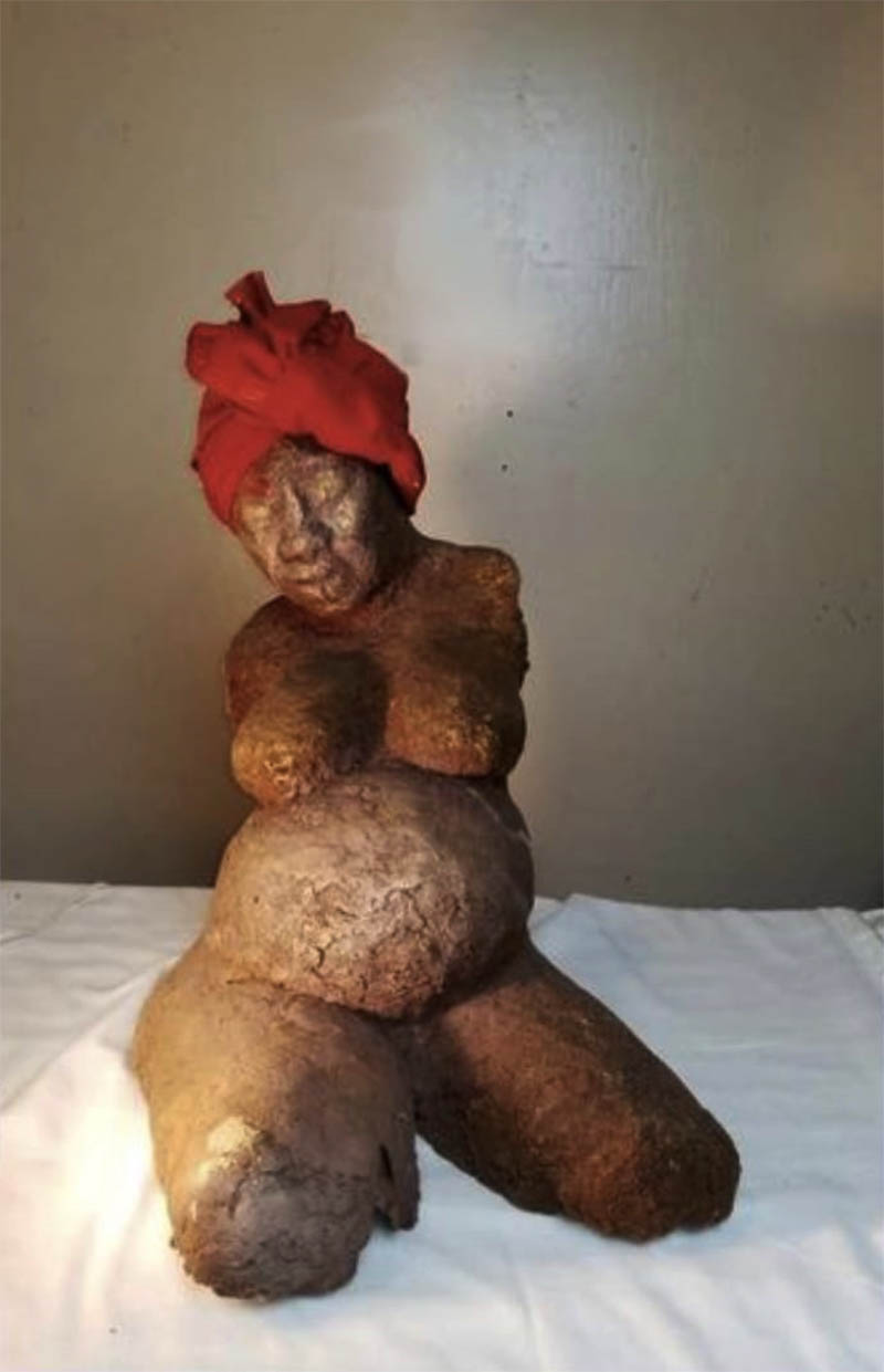
Now that we have discussed two principles of design using the iconic 1763 Monument as our subject, what can you say about how scale and proportion or repetition and rhythm are used in Anesia Joseph-Gonsalves’ The Conversation? Despite its small size, the figure in The Conversation is well-proportioned. By allowing the proportions to be normative, we are able to more easily perceive the circumstances of rhythm and repetition in the form. We recognise the repetition of the oval shape which corresponds to the figure’s abdomen, breasts, and head. Our eyes are drawn to her head because of the elaborate red wrap she sports – her only item of clothing and thus, a singular instance of disguise of her body. As we survey her head and her expression and her full facial features our eyes are led back into her body so we again perceive the fullness of her breast and abdomen. There is a rhythm to the movement of our eyes back into her body. A gentle caressing movement.
Can you guess where we will go next with these discussions?
Akima McPherson is a multi-media artist, art historian, and educator.