 Light is the final element of art left for us to consider. Light is as integral to art as breathing is to survival! Light defines! Without it, we literally cannot see forms. Without it, we cannot create the illusion of forms either. The interplay of light on a surface defines the form and gives it its three-dimensional appearance. By rendering areas of light and shadow, the artist communicates form on a flat surface. Without it, the form will appear flat! Light also gives emphasis, is directional, and is expressive and communicative.
Talking about light, first, let us consider chiaroscuro – a lovely Italian word that refers to the gradual shift around a curved surface of light to dark. Broken down into its composite parts, ‘Chiaro’ means light and ‘Oscuro’ means dark. Therefore, the word literally means light-dark. While chiaroscuro is said to have developed during the European Renaissance (1400-1600), it characterised the Baroque style (1600-1750) which followed. Since the Baroque, chiaroscuro has not defined an art movement. However, it continues to be employed in creating the illusion of three-dimensional rounded form on flat surfaces like canvas and paper and for dramatic effects in film and photography. By lighting a figure to have strong highlights adjacent to very dark shadows, the photographer or filmmaker creates dramatic effects and affect. Not surprisingly, the technique of chiaroscuro has always been known for precisely this.
Tone in visual art refers to the relative darkness or lightness of a colour. In other words, when we use the word tone we are referring to how much light or dark is present. Lighter tones vs darker tones. Stated yet another way, when we speak of tones we are concerned with how much black and/or white is added to a colour. Thinking of tone leads us to consider key. Key in art refers to the overall quality of lightness or darkness within a painted, drawn, or photographed composition. A picture with lots of lighter tones will be catogorised as a high-key picture. Can you deduce what a low-key picture is? Precisely. A low-key picture will be characterised by lots of dark tones. In these situations of high- or low-key, contrast is minimal.
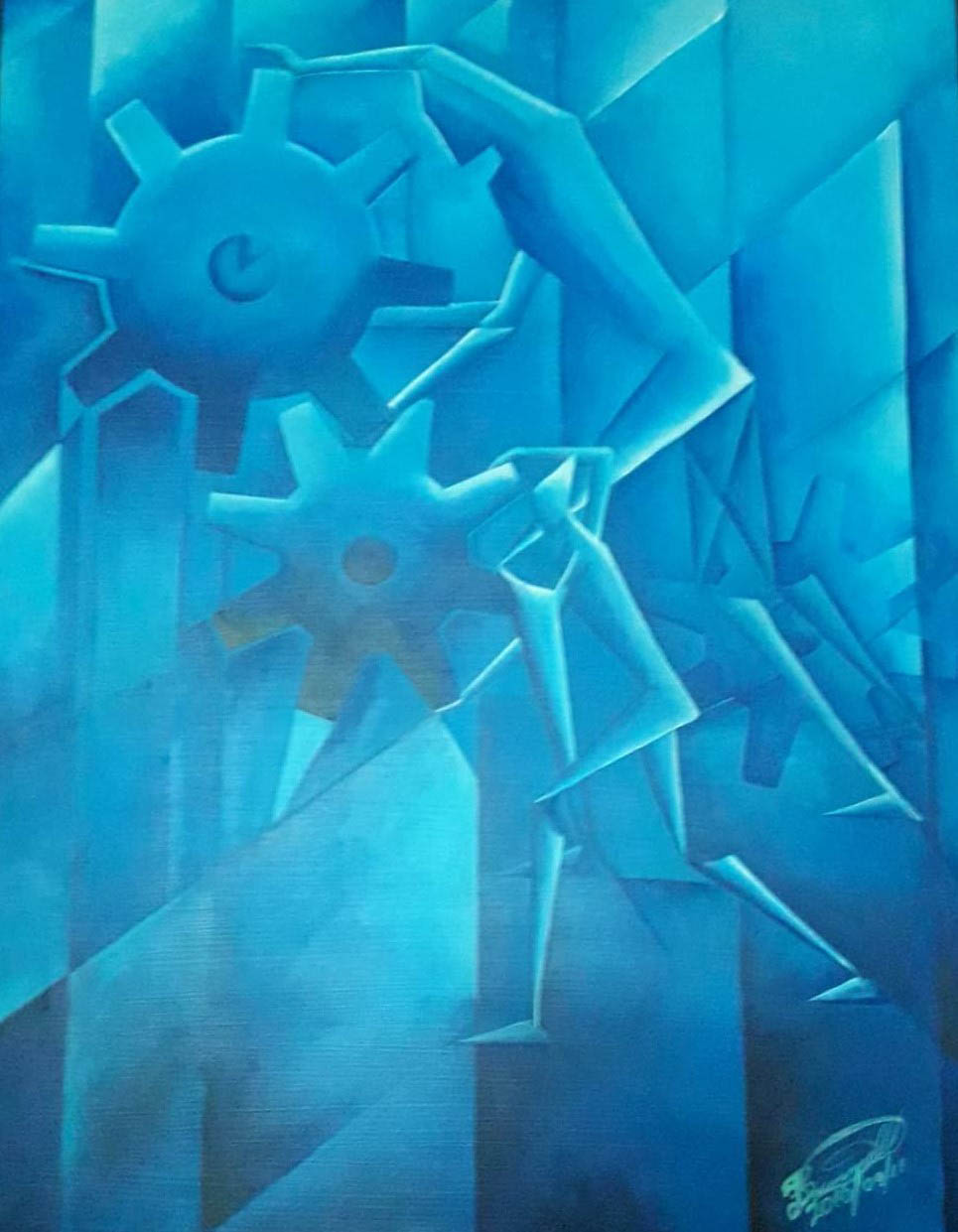
In Leevon Brummel’s Chronology has chiaroscuro been used on the human forms? How about the tones; is this a high-key or a low-key painting? I am giving you a chance to think about these before I weigh-in. When you have your answers, we can move on.
But before I weigh-in on those two questions, can you determine the light source of Chronology? In my made-up examples, I often defer to pictures comprised of fruit. I will do so again! Imagine a shallow-depth fruit bowl holding a hand of ‘clean-skin’ yellow bananas, a few green Buxton Spice mangoes, and a small watermelon. To draw or paint this composition (any composition in fact) using grayscale, local colour, or decorative colour (colours not natural to the object), it helps to be able to see areas of highlights and areas of shadow. This is hard to see when the space the fruits are in is well-lit. In a case like this, the light is likely diffused. To see highlights and shadows the artist will have to squint periodically as s/he works to create a likeness. However, the fruit can be positioned in a location that allows it to get natural light from one source only. For instance, a windowless corner. Or, unfortunately for the fruit, the artist may direct light from a spotlight to highlight the areas as preferred. While Chronology is a figment of Brummel’s imagination, he has used highlights along the bodies and the wheels, while casting the opposing side of each in shadow. Doing so mimics the relation of highlights and shadows on objects.
Light is as integral to Chronology as the figures and wheels are to this painting. Where can the brightest light be found? It is found along the body of the two (2) figures turning the wheels. The light allows us to see the precarity of their condition.
In Chronology light not only leads the eye but it is also used as a conveyor of the message. Interestingly, the light appears to come from multiple directions, casting areas into shadow that logically should be in the light. Additionally, the light makes the planes that break up the negative space visible as it also makes evident the tight, claustrophobic character of this space that the bodies occupy. As a consequence, the toil of the bodies bending to the wheel has a frightful dystopian character. Nonetheless, by strategically lighting the figures and other parts of the composition our eyes are drawn into and around it.
To answer the question I posed earlier — has chiaroscuro been used on the human forms? — definitely not. The figures are geometricised so there is no need to attempt chiaroscuro. Meanwhile, this is neither a high-key nor a low-key painting. Surveying the composition, you can see there is contrast. The composition includes very light tones and dark tones which lend to the air of impending doom. The situation for the two figures feels impossible. Hopeless. Penetrating the planes, one sees fragmented body parts merging into a wheel to the right. The blue colour evokes the blues. Melancholy. Sadness. There is a palpable absence of joy in the toil.
As we close looking at the six (6) elements of art and six (6) principles of design it may serve you if you are a student of art, whether formally or not, to reflect back on the works we have looked at in this series and see how you can analyse them using different elements and/or principles than we initially used. It may also serve you to create your own dictionary of art terms with those we used in this series.
In the next discussion, we will wrap things up before proceeding differently on what is hopefully a fun journey into the world of art. I do hope you have discovered some young gems along the way thus far.
Akima McPherson is a multi-media artist, art historian, and educator.