In this their eighth Conversation, artists Stanley Greaves AA and Akima McPherson examine Marjorie Broodhagen’s painting, Lukanani and Lemons, completed in 1967. ‘Lukanani and Lemons’ will be available for viewing from November 2 – 7 at the National Gallery, Castellani House
Stanley Greaves: Marjorie Broodhagen’s Lukunani and Lemons is one of those rare items in the National Collection, a still life painting. This type was unpopular among local artists and remains so.
There are too many interesting things to be seen around for landscape and figure painting. Works from imagination are also popular. It is a small painting, sometimes referred to as ‘cabinet painting’. The painting is in a robust style where one is aware of paint as well as what it is depicting.
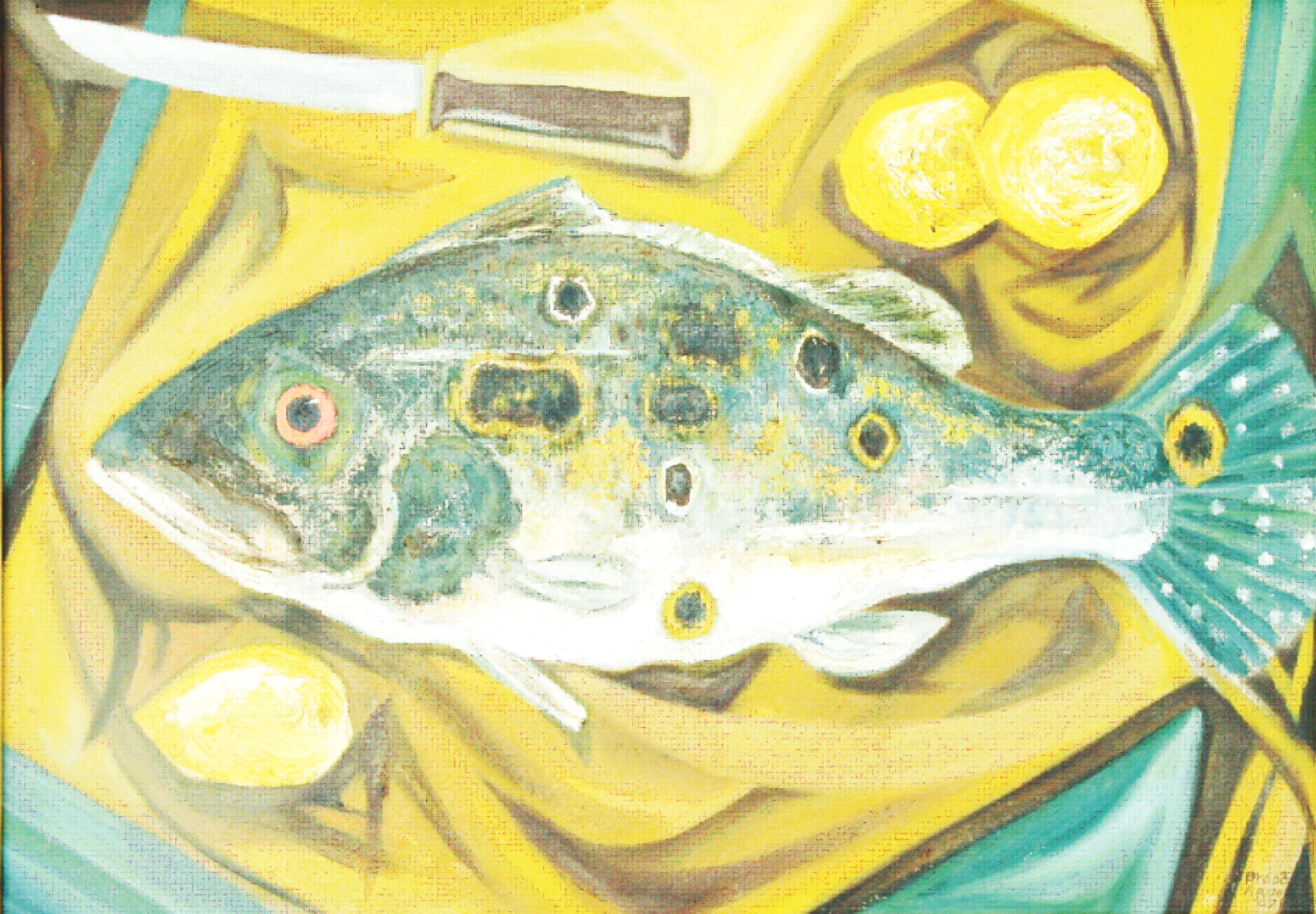
Akima McPherson: Indeed, still lifes are rare in the National Collection; thanks for pointing that out. The atypical perspective of Lukanani and Lemons and the combination of styles is exciting. In painting the folds of the fabric, Broodhagen has used a sort of Cubism. She has done so with the lemons also in attempting to show planes that we would not see from this perspective. Then, of course, the Lukanani is handled more realistically.
SG: Artists in the 1950s did experiment with Cubist presentations, but did not go the full way as presented by the Cubists, notably Picasso and Braque. Like most appropriations, including Surrealism, it was the style that attracted our artists with little research done on the philosophy of the School (the deconstruction of objects or figures as in Cubism). Broodhagen’s colour is well thought out based on the yellow to brown range complemented or balanced with greens, blue greens rather than the strict opposite blue. This would have been too predictable.
Her arrangement provides subtlety in tones and colours.
AM: Broodhagen, like her peers in the 1950s does, not delve deeply into Cubism, and I suspect doing so would have alienated the local audience accustomed to realistic scenes, but she does seem practised in colour theory. In a composition of mostly earthy yellows and browns and green she allows a sudden red, in the truest circular form within the composition, and this red is paired with green its colour complement which cause the two together to be enhanced/brightened.
SG: Alienating the viewing public has concerned artists worldwide since 20th century Modernism, especially viewers who have had no contact whatsoever with art. Viewers are more comfortable with what the eyes can see around them.
This problem was mentioned by the late Basil Hinds (our one and foremost art critic) decades ago. … We need an ongoing programme of art education in all schools. … Broodhagen is obviously technically skilled in the handling of paint. She does not hide brush strokes and allows the sense of paint to come through. We look at the objects and see the paint simultaneously.
AM: Broodhagen was a teacher at the secondary level for decades. In fact, she taught both my mother and older sister at the Bishops’ High. The work I saw my sister doing as a teen was, as I recall, very technical. I am of the impression that Broodhagen was a teacher of art techniques.
I think this is inadequately done in our schools. Self-expression is a wonderful goal but when appropriate, students need to learn basic techniques—like colour mixing or gradation—so they understand intimately some of what goes into making artwork.